 Cyber Matrix Today
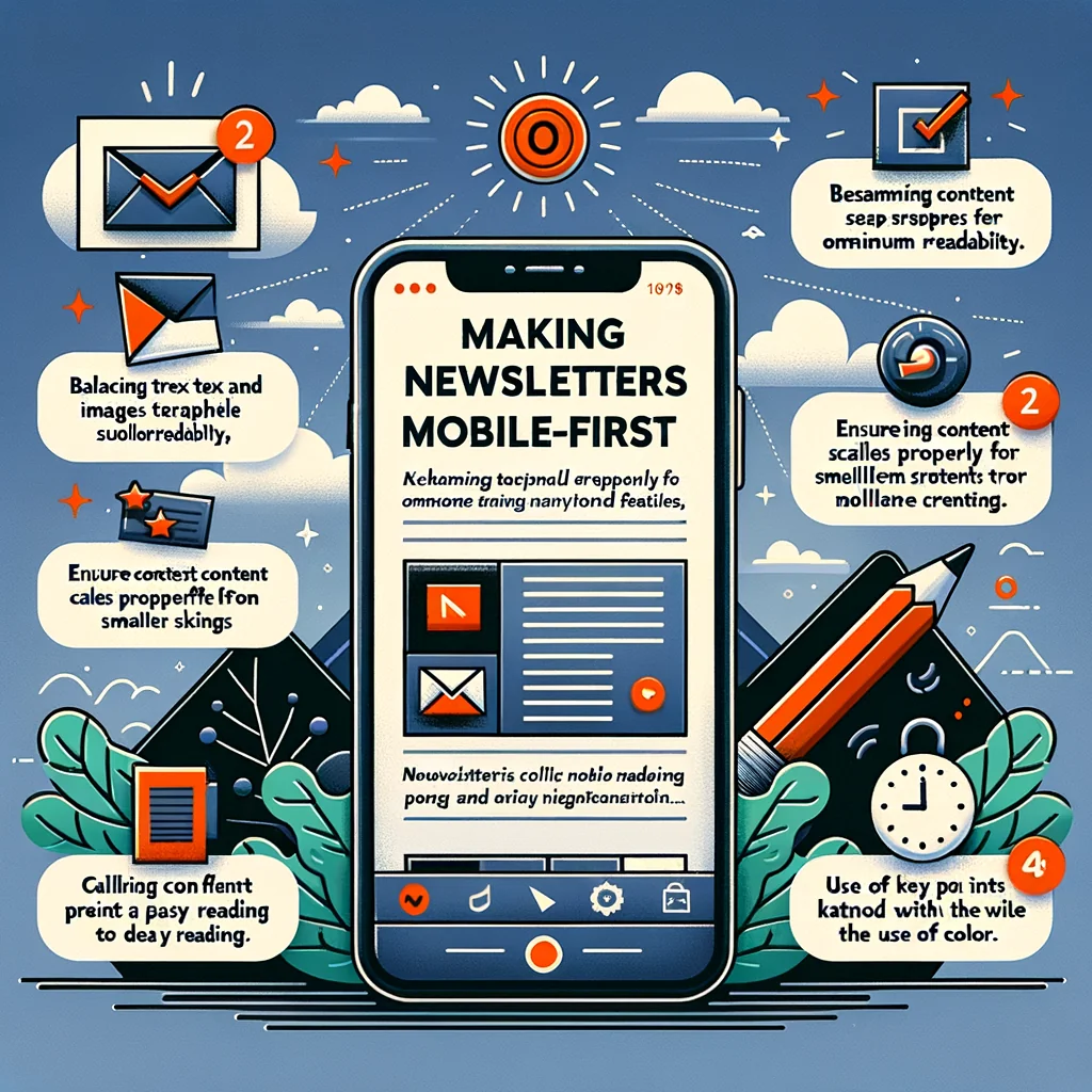
Making Newsletters Mobile-First: Stunning, Effortless Tips
Most newsletter readers open emails on their phones first. If your layout breaks on small screens, people do not zoom in; they swipe away. The good news: you...
In this article

Most newsletter readers open emails on their phones first. If your layout breaks on small screens, people do not zoom in; they swipe away. The good news: you can shape a mobile-first newsletter without a designer, using clear rules and simple checks.
What “Mobile-First” Really Means for Newsletters
Mobile-first email design starts from the phone screen and then adapts for larger devices, instead of the other way around. The idea is to give phone readers the cleanest, easiest version, because they are the least patient and have the least space.
Think of a subscriber opening your email while waiting for coffee. They have one free thumb, a small screen, and a noisy background. A mobile-first newsletter respects that setting: clear subject line, sharp headline, short paragraphs, and obvious calls to action.
Set Up a Simple, Mobile-Safe Layout
You do not need fancy graphics to make a strong layout. A clean structure with a single column and clear spacing already feels professional on mobile screens.
Use a Single-Column Structure
Multi-column layouts often break on small screens or shrink into unreadable blocks. A single-column layout flows from top to bottom and keeps the reading path clear.
Many email tools offer basic “one-column” templates. Start from one of those and adjust content blocks instead of building complex grids. This saves time and also reduces layout bugs in older email apps.
Choose Mobile-Friendly Width and Spacing
A simple width rule keeps your content readable: design for 320–600 pixels. Most email services handle this by default, but you can still control how dense or open the content feels.
| Element | Recommended Setting | Why It Helps on Mobile |
|---|---|---|
| Layout width | 320–600 px | Prevents horizontal scrolling and cramped lines |
| Body font size | 14–16 px | Keeps text readable without pinch-zoom |
| Line spacing | 1.4–1.6 | Makes sentences easy to track on small screens |
| Paragraph length | 1–4 sentences | Avoids big “walls of text” on phones |
| Button size | Min. 44 x 44 px | Thumb-friendly taps, fewer missed clicks |
Keeping these settings in mind while you write saves you from major rework later. Over time, they become habits rather than rules you need to check every time.
Write and Structure Content for Small Screens
Strong mobile newsletters start with strong writing. Clear structure, short sections, and sharp hierarchy matter more than fancy graphics or code.
Front-Load Value in Subject and Preheader
On mobile, people see less of your subject line and preheader, so each word counts. Aim for subjects under 50 characters and preheaders under 90 characters, with the key benefit early.
Instead of “Our Latest Company Updates and Announcements,” use “New pricing, plus a quick template you can steal today.” The second version hints at a clear gain and a concrete asset.
Use Clear Headings and Short Sections
Dense blocks of text push people away on small screens. Break the content into short sections with descriptive headings so readers can skim and choose what to read in depth.
- Use subheadings every 2–4 paragraphs.
- Keep most paragraphs under four lines on mobile.
- Highlight key phrases in bold, but do not overdo it.
This structure helps fast readers scan the email, pick up the main ideas, and still click through even if they do not read every line.
Design Text and Fonts for Readability
Text is the main part of most newsletters. Even simple font choices can raise your click rate and lower unsubscribes, because readers do not have to work hard to get your point.
Pick Web-Safe Fonts and Sizes
Many email clients strip custom fonts and fall back to basic options. To avoid random results, choose safe fonts like Arial, Helvetica, Georgia, or system fonts. Then stay consistent.
Aim for 14–16 px for body text and 20–24 px for main headings. Tiny fonts may look neat on desktop, but they often turn into eye strain on a phone. Slightly larger text, with enough line spacing, feels more open and easier to scan.
Use Contrast That Works in Day and Night Modes
Many people read emails in dark mode. If you use colored text on colored backgrounds, you risk unreadable sections. High contrast pairs, such as dark text on white or very light gray, are safer.
Avoid placing text directly on busy images. If you need text over an image, use a solid or semi-transparent overlay behind the text so the words stay readable on small screens.
Make Buttons and Links Thumb-Friendly
On mobile, links that are too small or placed too close together cause mis-taps and frustration. Clear, tap-friendly calls to action guide readers without effort.
Design Simple, Bold Calls to Action
Text links can work, but buttons draw the eye and invite action. Each main action should stand on its own, with enough white space around it, so there is no doubt where to tap.
- Use short, specific button labels like “Download the Guide” or “Book a 15-Min Call.”
- Place your primary button near the top, close to the main value promise.
- Leave plenty of padding so the button feels large on a thumb.
A simple test: if you struggle to hit the button with your thumb during a quick scroll, it needs more size and more space around it.
Handle Images and Media Without Breaking Mobile Layouts
Images can help explain a point or show a product, but they can also slow down loading or distort the layout. A few careful choices keep them helpful instead of harmful.
Keep Images Light and Responsive
Compress images so they load fast on mobile data. Many free tools can reduce file size without visible quality loss. Aim for JPG or PNG files under 200 KB when possible.
In your email tool, enable “responsive images” or similar settings, so pictures scale down on small screens instead of causing horizontal scrolling. Avoid fixed widths that force readers to zoom out.
Add Alt Text and Avoid Image-Only Emails
Some readers block images by default, or use screen readers. Descriptive alt text tells them what the image shows and also adds context if the images fail to load.
Do not send an email that is one big image. Many clients will either block it or display it badly on mobile, and your copy becomes unreadable. Always include real text for key parts of your message.
Use Templates and Tools Instead of a Designer
A smart setup can remove most design work from your plate. Email platforms already include mobile-ready tools that save you from building layouts from scratch.
Start with Proven Mobile Templates
Most mainstream email services offer templates that already follow mobile-first rules. Look for a simple one-column template with clear headings, and edit the colors and fonts to match your brand.
Keep your layout library small. A single “standard newsletter” template and one “announcement” template are often enough. This consistency trains readers to understand your structure over time.
Lean on Built-In Editors and Blocks
Drag-and-drop editors let you add text blocks, images, buttons, and dividers that already use responsive code. Use these blocks instead of pasting complex HTML or nesting tables.
If you need a quick layout tweak, such as adding a two-column section for desktop, check if your tool lets you stack columns on mobile. That way, you get variety on big screens without hurting phone readers.
Test Your Newsletter Like a Mobile Reader
The surest way to spot weak areas is to read your own email on a phone, the same way your audience would. A few minutes of testing before sending can prevent many problems.
Run Simple Pre-Send Checks
Before each send, inspect the email in at least one phone and one desktop preview. Many email platforms offer built-in previews and test sends, which make this easy.
- Open the email on your phone and scroll at normal speed.
- Check how the subject and preheader appear in the inbox list.
- Tap every button and key link to ensure they are easy to hit.
- Look for lines that wrap badly or images that overflow the screen.
Notice any point where you feel bored or confused. Those are spots to cut, rephrase, or break into smaller parts. This small habit helps each new issue feel smoother than the last.
Prioritize Clarity Over Decoration
A mobile-first newsletter does not need heavy design. It needs clear structure, readable text, and obvious actions. Simple decisions about fonts, spacing, buttons, and images add up to a smooth experience on small screens.
By starting with a clean template, writing for quick mobile reading, and testing each send on a real phone, you can produce newsletters that feel professional and easy to use, even without a designer on your team.